First-time app development with new AI tools
My mum is a busy childminder and as an immigrant, one of the enduring challenges of the job is communicating effectively in another language. Childminding is regulated the same way as schools and nurseries in the UK and all settings are taught to report on child development the same way.
Parents are also vested in receiving effective updates on how their child did during the day. But child care is demanding and demands practicality, which goes against the order and process of regular observations, especially when those are in a second language.
So after learning of recent popularity of LLM based coding tools like Cursor and Replit Agent, I decided it was time to try to create an app to alleviate my mum's problem. It's really cool how others are hooking these tools with voice commands. Even teens are confidently creating in this new way.
This app is not on the appstore yet 😅 but I can now sideload it on my iPhone with Xcode! I also didn't know it costs £80 a year to host it on the appstore! 😱
Inspiration and design constraints
I had two sources of inspiration and additional constraints in mind:
- Nikita Bier had just featured on Lenny's product podcast, and I wanted to imitate Gas' concept of not having to type at all for you to use the app. I also wanted to surface this 'aha' moment as soon as possible, and added it as the tagline for the logo.
- I hate habits by themselves. I love games. So I thought of adapting habit tracking and gaming concepts from apps like Duolingo to try to make child observations more fun.
- I believe this will work better by making it product lead. So I'm favouring parents over childminders in the design ie. aim for a daily report every day and building with the aim of ultimately making the app parent-led.
- I also researched the UK government child development framework for childcare providers and how other apps handle observations. While it feels kind of forced to link any given activity to an EYFS development milestone, it is what it is and having a consistent stream of observations that can be built into reports is a key pain point for childminders.
So I decided:
- The app will only allow one to add today's and yesterday's observations, to promote simplicity, urgency and fresh data
- Childminders can add a photo and tap on descriptors based on emotional, time of day and EYFS milestone categories
- At the end of the day, childminders can press 'share' and the app would prepare an observation message so it would be appealing and easy to consume for parents. Voice observations do not translate well to emails so they were not included this time but there's a lot of potential for summarisation and nuance with ML here as photos can really tell 1000 words, and voice notes would compliment them really well.
Setup
- I downloaded Cursor, which has a generous 2 week trial on Claude 3.5. My aim was to blindly try to make it to the Appstore, but the project needs more time.
- I had Xcode already, so I just had to download additional device emulators
- I used my mac M1, and at later stages I used my iPhone to test drive the app
Steps
- Getting to use Cursor for the first time was pretty seamless. I came prepared with a prompt text file which I dutifully fed to it's context window:
We are making a simple iOS app for childminders to track children's activities.
It looks like a game with a playful and engaging interface.
There is minimal typing required; updates are made using preset moods and activity icons.
Each activity update is completed with a photo submission.
The app uses a colorful and animated interface to make tracking fun and intuitive.
There is a progress bar that fills as daily activities are completed, encouraging consistent updates.
Users earn points and badges for completing daily and weekly activity goals.
The app has a library of predefined activities (e.g., nap time, playtime, meals) that the childminder can select with a single tap.
There is a "Submit Update" button that finalizes the entry after selecting the mood, activity, and adding a photo.
After the update is submitted, the app stores the information and allows the childminder to view progress in a streak-based system.
The app compiles all daily or weekly updates into a downloadable PDF or a poster-style photo that visually summarizes the child’s activities.
There are notifications and reminders that encourage childminders to complete their daily updates.
The app's home screen shows the current streak, upcoming tasks, and earned badges.
Complete this app in its entirety, ensuring a smooth and engaging experience for childminders to track children's activities efficiently and enjoyably.
It doesn't just complete code, it can add, delete, and help you understand code.
- Cursor works like this:
Code understanding by converting it to LLM-readable embeddings
Additional code analysis fairy dust
LLM's to understand what you're asking, respond with code, and keep track of the conversation and file history in their context window
- Setting up Xcode to show a preview was really painful. It took me over an hour and killed the initial enthusiasm. It finally worked when I created a dummy project and filled it with the codebase Cursor had initially created
- I also had no idea about how to code apps, so that added to the frustration of getting a preview to work in Xcode. ChatGPT was trying to help in circles. Google wasn't finding help that was relevant enough. So it took trial and error - and it's a common complaint about Xcode
- I am not checking all the code and how it works 😱.
- Created a free logo with Shopify's Hatchful
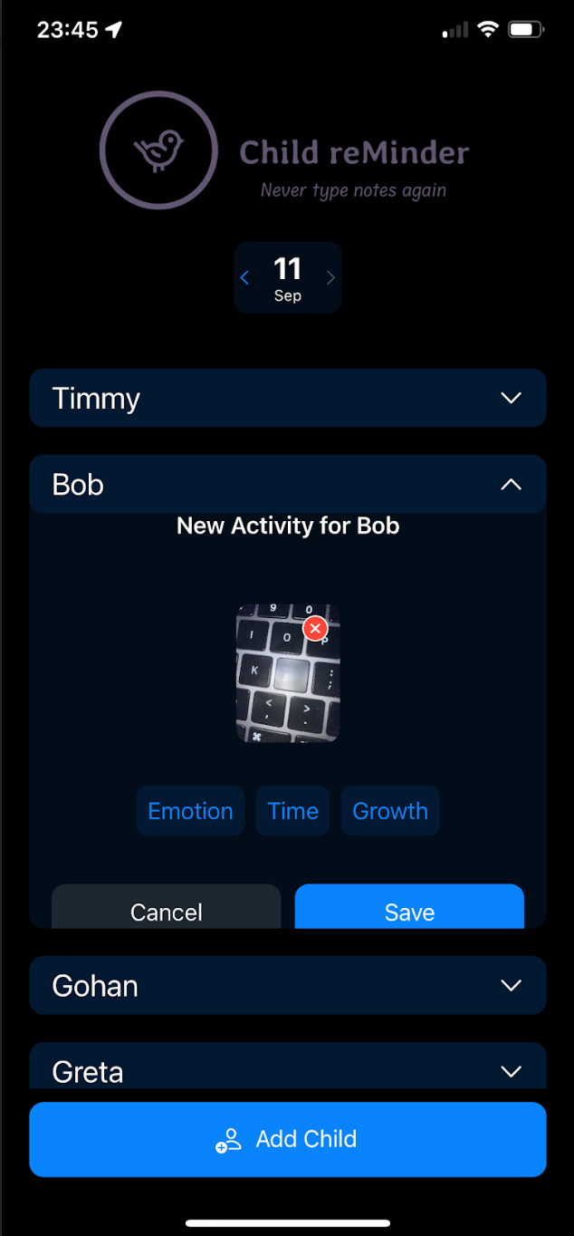
- The app still looks very raw but it's great to see a product in your hands!
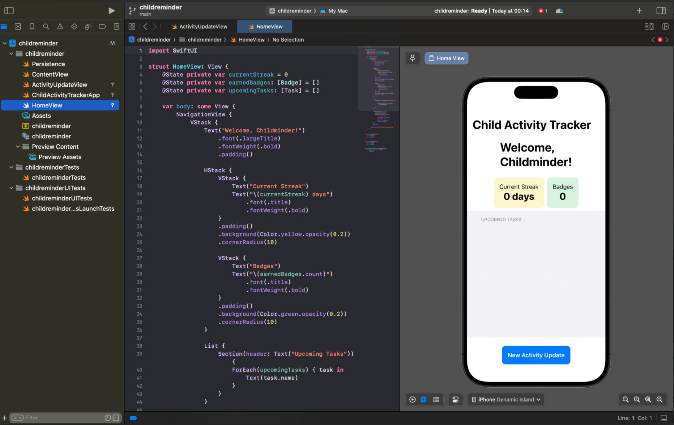
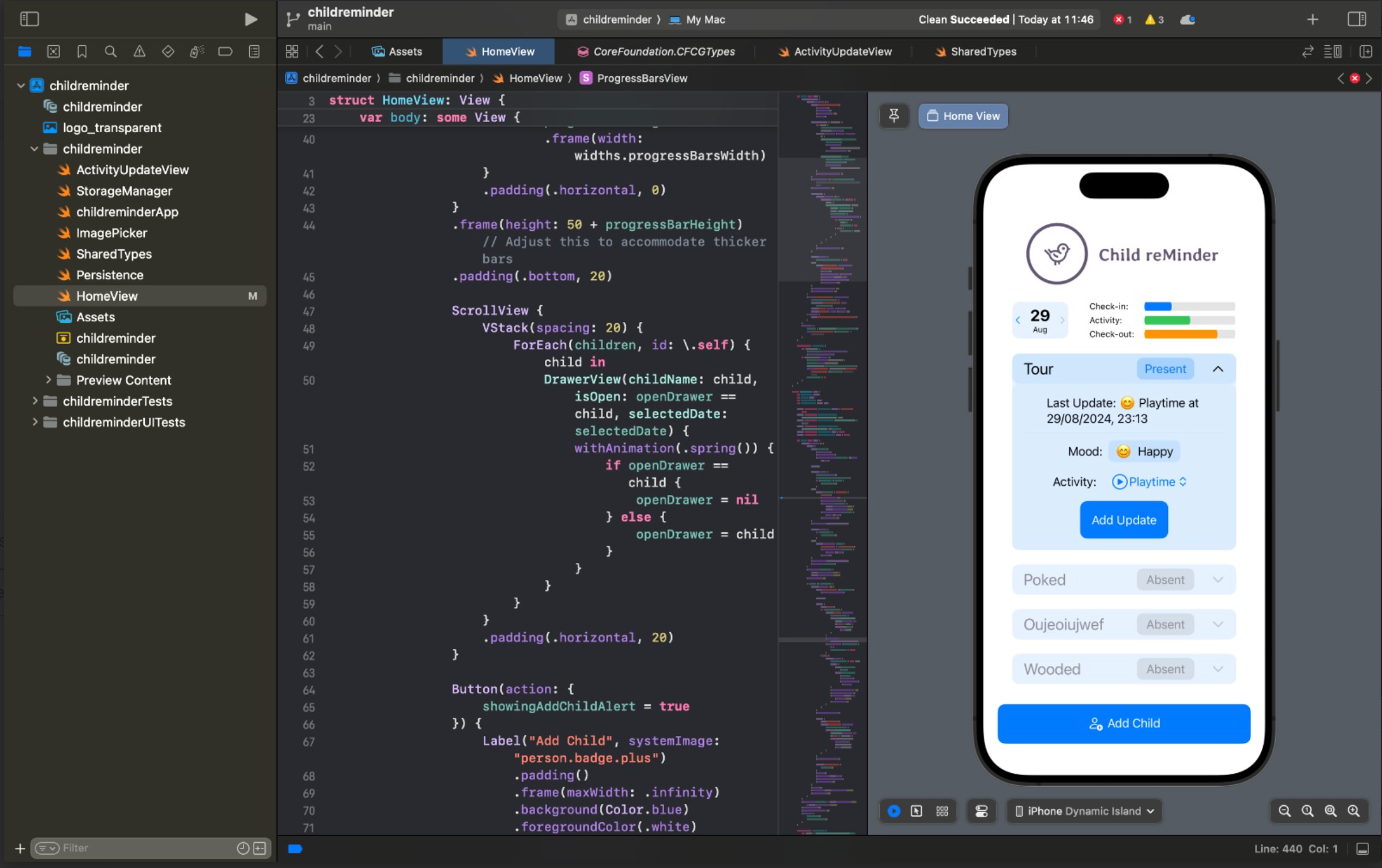
Here it was in full swing. I wanted the progress bar to complete for three key parts of the day, i.e once all the kids were checked in. After testing with my mum, I found the interface was too complicated. So I decided to cut down and simplify the designs, even though I would still want to make it look more like a video game at a later point.
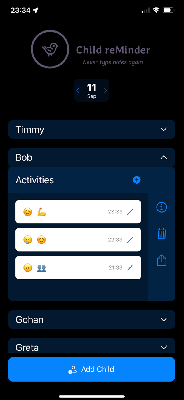
Already dark mode native! 😜
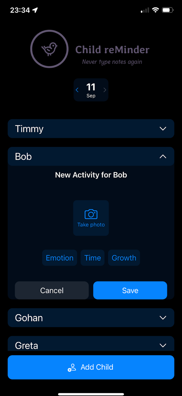
Photo taking functionality on the app as seen from my phone
Learned lessons
- Developing apps is hard! So many files for such a simple app!
- As Cursor is not fully efficient, I was working at maybe 30% of the speed of me if I knew how to program in Swift.
- Phone screen real estate is small and a challenge to design for!
- App permissions can just be configured in a file?!!!
- Cursor is neat but being dependent on Xcode is a fairly big barrier to a fully replicable environment setup. When an LLM gives me some advice, it sucks to try to find it in the Xcode UI, especially since the LLM may be hallucinating in an effort to be helpful. So Cursor was less powerful for app development specifically in my experience although it's UI indications were correct.
- It would be nice to see what the change proposed by Cursor is going to look like before I accept it. It feels like the feedback loop is broken here and could be much tighter, where I can fully tailor the change in preview before committing to the codebase
- Save as often as you can ie in Github, because some proposed changes can completely alter the design! So I'd love to learn how to develop in specific parts of the app, resting easy that Cursor will not edit another area's design or code logic as an aftermath
- The state of attention window of the LLM is important to 'getting you' more effectively. I learned to initialise a new session by asking Cursor how all the loaded files work together first. The more warmed up it is, the less context you have to give it. So these coding sessions build up in intensity after one hour because both you and the LLM get into a flow state
- Sometimes Cursor is lazy! It suggests code changes but does not apply it to the files. Bad LLM! Bad!
- In my app development case, sometimes Cursor created completely new or duplicate files 😤 it was frustrating to ask for a change for the 3rd time and seeing no changes in the preview only to find out Cursor started creating it's own little world
- You can end up in very semantically heavy, circular and pedantic design changes because you don't understand the code and the design elements used. This can lead to you thinking you're one step from the the almost perfect design you took 7 prompts to craft, only for the LLM to ruin it with a cascade of well meaning but misguided changes that create a blast zone in the area. This is because LLMs are also not deterministic, as explained in my article here
- So, if you can get a specialised coding LLM, this could also have a massive impact in quality. It would be a cool challenge to start encoding app designs as well - I wonder how much good quality training data of app design is out there vs web designs which come for free with crawling
- Cursor is not very adapted to Swift, as far as I've seen. It creates code that leads to a lot of compilation errors and this confounds changes and breaks productivity. Because you don't understand the code, sometimes you're at the mercy of whatever the solution the LLM thinks of is, and this can go on for a few long loops before you solve it
- You really have to understand how the files talk to each other at a minimum to guide Cursor to make the right changes and navigate build errors
- One general prompt that worked very well was 'Ask me questions until you're 95% sure of how to implement this' for more complex changes. It gave me space to answer the questions and then it acted in that next prompt immediately!
- Try to have the designs ready on Figma for instance and load them in as code. Let Cursor focus on the data and logic, rather than try to describe something that you can probably reproduce in much higher fidelity on Figma
- I'm not sure the trial is profitable for Cursor, they may remove it in the future, but it sure was a lot of fun to code more natively instead of copy pasting it from an LLM. If they can tighten the feedback loop for app design this can become downright addicting
